플러터에서 버튼을 만들때 주로 사용되는 위젯은 다음과 같음.
ElevatedButton, TextButton, OutlinedButton, IconButton 그리고 Inkwell.
1. ElevatedButton
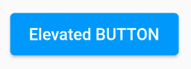
이렇게 위로 튀어 나와있는 듯한 버튼이 ElevatedButton임.
예전에는 RaisedButton이라고 불렀음.
2. TextButton
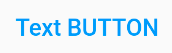
이렇게 버튼의 기능을 가지고 있는 텍스트를 TextButton이라고 함.
예전에는 FlatButton이라고 불렀음.
3. OutlinedButton
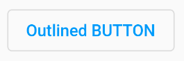
이렇게 테두리를 가지고 있는 버튼을 OutlinedButton이라고 함.
예전에는 OutlineButton이라고 불렀음.
위 세가지 버튼은 속성 중 style을 버튼종류.styleFrom()으로 지정해서 커스텀할 수 있음.
또한, onPressed와 child를 반드시 필요로 함.
TextButton(
  style: TextButton.styleFrom(
    primary: Colors.blue,
  ),
  onPressed: () { },
  child: Text('TextButton'),
)
// 스타일 설정 예시
공식 문서 : https://docs.flutter.dev/release/breaking-changes/buttons
New Buttons and Button Themes
The basic material button classes have been replaced.
docs.flutter.dev
4. IconButton

위와 같이 아이콘이 들어간 버튼을 만들때 사용가능한 버튼임.
icon이라는 속성이 있어서 원하는 icon을 넣어주면 됨.
공식문서 : https://api.flutter.dev/flutter/material/IconButton-class.html
IconButton class - material library - Dart API
A Material Design icon button. An icon button is a picture printed on a Material widget that reacts to touches by filling with color (ink). Icon buttons are commonly used in the AppBar.actions field, but they can be used in many other places as well. If th
api.flutter.dev
5. Inkwell
잉크웰은 엄밀히 말하면 버튼이 아니라 특정영역의 터치를 인식하는 위젯을 의미함.
하지만 속성으로 onTap, onTapCancel, onTapUp, onDoubleTap, onLongPress 등이 존재해 다양한 제스쳐를 인식할 수 있고, 이를 이용해 본인만의 버튼을 만들 수 있음.
개인적으로 가장 유용하게 쓴 위젯.
공식 문서 : https://api.flutter.dev/flutter/material/InkWell-class.html
InkWell class - material library - Dart API
A rectangular area of a Material that responds to touch. For a variant of this widget that does not clip splashes, see InkResponse. The following diagram shows how an InkWell looks when tapped, when using default values. The InkWell widget must have a Mate
api.flutter.dev
'Front-End > Flutter' 카테고리의 다른 글
| [Flutter] 08. 시간 (0) | 2024.03.16 |
|---|---|
| [Flutter] 07. Row, Column, GridView (0) | 2024.03.16 |
| [Flutter] 05. 색상 (0) | 2024.03.16 |
| [Flutter] 04. 반응형 위젯 (0) | 2024.03.16 |
| [Flutter] 03. showModalBottomSheet (0) | 2024.03.16 |


